
If you manually resize buttons, move text boxes by hand, or constantly adjust spacing when you change copy in Figma, you are wasting valuable design time.
Figma’s Auto Layout feature solves this problem completely. It acts like a smart layout engine, allowing your designs to stretch, shrink, and adapt on their own when you add content.
This step-by-step Figma Auto Layout tutorial teaches you how to master this essential tool, design a responsive button, and organize complex layouts effortlessly.
What is Figma Auto Layout?
Auto Layout is a property you can add to frames. It allows you to create dynamic designs that grow or shrink to fit their content. Think of it like CSS Flexbox for designers.
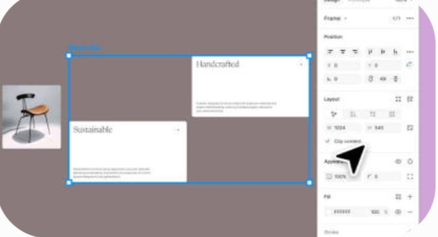
With Auto Layout, you can build:
- Buttons that expand automatically when you type longer text.
- Menus and Lists that rearrange themselves cleanly when you delete or add items.
- Responsive Cards that look perfect on both mobile screens and desktop monitors.
The Core Auto Layout Properties
When you apply Auto Layout to a frame, you will see a dedicated control panel appear on the right side of your screen. To design effectively, you must understand these five simple settings:
1. Direction (Horizontal or Vertical)
Choose whether you want your design elements to stack side-by-side or on top of one another.
- Horizontal Layout (\rightarrow): Perfect for navigation menus, button groups, and rows.
- Vertical Layout (\downarrow): Great for forms, lists, cards, and page sections.
2. Gap Between Items
This setting controls the spacing between your elements. Instead of manually pushing layers around, you type an exact pixel value (like 16px), and Figma handles the math automatically.
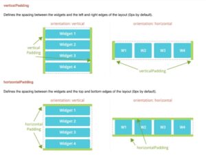
3. Padding (Horizontal and Vertical)
Padding controls the breathing room inside your frame. It keeps your text and icons from touching the outer edges.
4. Alignment
The 9-dot grid in the control panel lets you choose where your elements sit inside the parent frame. You can align your text and icons to the top-left, center, bottom-right, or anywhere in between.
5. Sizing (Hug vs. Fill vs. Fixed)
This controls how your frame behaves when size changes occur:
- Hug Contents: The frame shrinks or expands to tightly fit whatever is inside it.
- Fill Container: The element stretches to take up all the available space inside its parent frame.
- Fixed Width/Height: The element stays exactly the size you set, no matter what happens around it.
Step-by-Step: How to Build a Responsive Button
Let’s build a button from scratch to see Auto Layout in action.
Write your textStep 1
Press T on your keyboard, click anywhere on your canvas, and type your button text (e.g., “Submit”).
Apply Auto Layout
Step 2
Select your text layer and press Shift + A. Alternatively, right-click the text and select Add auto layout. You will see a blue frame appear around your text.
Style your button
Step 3
Go to the right-hand panel. Under Fill, click the + sign and add a color (e.g., blue). Then, change your text color to white. Under Frame, adjust the corner radius to 8px to give your button rounded corners.
Adjust your padding
Step 4
In the Auto Layout section, set your Horizontal Padding to 24px (left and right space) and your Vertical Padding to 12px (top and bottom space).
Test the responsiveness
Step 5
Double-click the text inside your button and start typing a longer phrase, like “Submit Application”. Watch the button instantly expand to fit the new text while maintaining perfect padding!
Two Pro Tips for Advanced Layouts
Once you master simple buttons, you can use these advanced concepts to build complex UI cards and web pages:
Use Nested Auto Layouts: You do not have to put everything into a single frame. You can place an Auto Layout frame inside another Auto Layout frame. For example, build a horizontal “Icon + Text” row, and drop that entire row into a vertical “Card” layout.
Absolute Positioning: If you want an element (like a “sale” badge or a close button) to float on top of an Auto Layout frame without disrupting the layout order, select the element and click the Absolute Position icon in the top-right of the Design panel.
Say Goodbye to Manual Adjustments
Mastering Figma Auto Layout saves hours of tedious work. It ensures your handoff to developer teams goes smoothly because your design files will mirror real, responsive HTML/CSS code. Take fifteen minutes today to practice building a button, then try a card, and watch your design workflow transform.